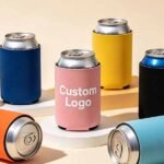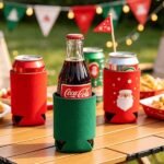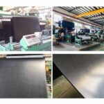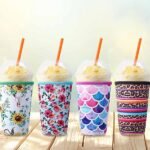
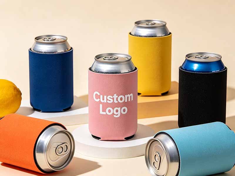
A neoprene can cooler appears to be one of the simplest promotional products a brand can order. It uses a small amount of material, has a familiar shape, and can be distributed quickly at festivals, trade shows, sporting events, beverage launches, corporate gatherings, and retail activations. Yet that apparent simplicity often causes teams to underestimate the decisions behind the product. A logo that looks balanced on a computer screen may wrap too far around the can. Small text may become unreadable after sewing. A sleeve described as “standard size” may not fit the beverage actually served at the event. Even a perfect product can fail if it arrives after the campaign date.
To design an effective neoprene can cooler, confirm the beverage dimensions, target audience, distribution plan, neoprene thickness, construction, artwork area, printing process, packaging, quantity, and delivery date before production. Keep the main message simple, protect important graphics from seams, test the cooler on the actual can, and approve a complete physical sample before releasing the bulk order.
The best campaign coolers are not necessarily the ones with the most colors, accessories, or printed information. They are the ones people understand immediately, use comfortably, photograph naturally, and keep after the event. Picture 10,000 attendees raising the same branded cooler during an outdoor concert. That moment can generate photographs, social media exposure, product trials, and months of continued use. However, the opportunity exists only when design, materials, manufacturing, packing, and event logistics have been planned as one connected project.
What Makes a Can Cooler Campaign Effective?
An effective campaign starts with one clear objective, a defined recipient, and a practical distribution plan. The cooler must communicate the brand message within seconds while remaining useful enough to keep. Strong campaigns connect artwork, beverage format, quantity, packaging, and delivery with measurable goals such as product trials, QR scans, event visibility, social sharing, customer retention, or retail engagement.
Define One Primary Objective
A promotional can cooler can support brand awareness, product sampling, sponsorship, customer retention, lead generation, retail sales, or event participation. These goals can overlap, but one should control the design. Without a primary objective, every stakeholder tends to add another element. The final artwork becomes crowded with a logo, campaign slogan, website, event date, sponsor list, product claim, legal text, social handle, and QR code competing for attention on a relatively small surface.
Write the campaign objective as a single measurable statement before discussing colors or printing. A beverage company may want consumers to remember a new flavor after a tasting. An event organizer may want attendees to scan a code and register for next year. A corporate team may want to give guests a practical item that keeps the company visible after the meeting. A distributor program may need the cooler to reinforce cooperation between two brands.
The objective determines the visual hierarchy. Brand-awareness programs usually give the logo and recognizable color system the largest space. Product launches may prioritize the beverage name, flavor, or package graphics. Lead-generation campaigns need a clear reason to scan rather than a QR code placed without context. Sponsorship designs should make the relationship between the event and sponsor understandable without forcing the viewer to study several small logos.
| Campaign objective | Primary design focus | Practical performance indicator |
|---|---|---|
| Brand awareness | Large logo and distinctive brand colors | Units distributed, photographs, repeat visibility |
| Product launch | Product name, flavor, or launch message | Samples redeemed, product trials, sales response |
| Lead generation | Short call to action and trackable QR code | Scans, registrations, enquiries |
| Event sponsorship | Event identity and sponsor recognition | Audience reach, social mentions, media exposure |
| Customer retention | Better material feel and long-term usability | Repeat use, customer feedback |
| Retail activation | Product connection and purchase incentive | Redemptions, store participation, sell-through |
A can cooler normally performs best with one dominant message and one secondary action. Most recipients make their first judgment while standing in a line, walking through a venue, or receiving several promotional items at once. If the design requires a detailed explanation, it is probably asking the product to communicate more information than the available print area can support.
Understand the User and Setting
The recipient’s behavior should guide the product more than broad demographic assumptions. A beer-festival visitor, corporate conference guest, sports fan, golf participant, retail shopper, and music-festival attendee may all receive can coolers, but they use and evaluate them differently. The campaign team should consider what beverage the person will hold, where the product will be used, how long it will be carried, and whether it is likely to appear in photographs or social posts.
Outdoor environments usually favor bold artwork with strong contrast because sunlight, movement, and crowded backgrounds reduce visibility. A logo that looks refined on a monitor may disappear when printed in dark blue on black material and viewed from several meters away. Premium hospitality programs may benefit from restrained typography, a more substantial hand feel, individual packaging, or a structured construction. High-volume festivals usually need a lighter, flatter product that staff can store and distribute efficiently.
The beverage category also influences the visual tone. Craft beer campaigns may use illustrative graphics, local references, or limited-edition artwork. Energy-drink and sports promotions often favor high-contrast colors, vertical compositions, and slim-can formats. Corporate programs may require a controlled brand system, accurate Pantone references, and space for more than one approved logo.
Long-term usefulness matters because continued use extends campaign exposure. A practical cooler may remain in a vehicle, kitchen drawer, picnic basket, boat, workshop, or camping kit for months. A more decorative but inconvenient product may be discarded after the event. The most valuable design is therefore not merely attractive at the distribution table; it is suitable for the recipient’s real habits after the campaign ends.
Plan the Distribution Method
Distribution affects construction, packaging, carton volume, labor, and product cost. A cooler handed out to thousands of festival attendees has different requirements from one placed in an influencer box, retail gift set, distributor kit, or corporate welcome package. The distribution method should be decided before the product structure because it influences whether the cooler needs to lie flat, retain its shape, carry a barcode, include an insert, or arrive separated by location.
Foldable sleeves are efficient for mass campaigns because they occupy less storage space and can be stacked behind a booth. Event staff can access them quickly without opening individual retail packages. Cylindrical styles retain their shape and may create a stronger premium impression, but they use more carton space and are less convenient when venues have limited storage. Individual bags can protect presentation, yet they also add packing labor, waste, and unpacking time.
Multi-location campaigns require more detailed planning. The purchasing team should confirm the quantity required by each venue, the artwork version assigned to each destination, the receiving date, the available storage space, and whether local teams must add cards or other promotional products. Cartons should identify the campaign, design version, quantity, and destination clearly enough that warehouse and event personnel can understand them without opening every box.
Shipping efficiency should be evaluated as part of campaign cost rather than after the product is finished. A small structural change may allow more units per carton and reduce freight volume. Conversely, an accessory or premium package may increase the delivered cost more than the manufacturing price suggests. A useful design balances presentation with the practical realities of storing, transporting, and distributing the order.
Control Multiple Artwork Versions
Multiple designs can make a campaign more relevant to different products, regions, teams, venues, or distributors. A beverage company may create separate coolers for several flavors. A national event may require local city names. A sports campaign may use different team colors, while a sponsor program may need co-branded artwork for individual partners. These variations can improve engagement, but they introduce a greater risk of production and packing errors.
Every version should have a unique artwork code, revision number, quantity, base color, packaging method, and destination. File names such as “final,” “final-new,” and “final-revised-approved” are unreliable because several people may have different files with similar names. A structured code such as NCC-SUMMER-LA-R03 makes it easier to identify the product, campaign, location, and revision.
The customer should provide one controlled production folder containing only approved artwork. Superseded files should remain outside that folder. One authorized person should give the final approval after comments from marketing, legal, sponsors, agencies, and distributors have been consolidated. Manufacturers should never have to decide which of several conflicting email attachments represents the final version.
Variation quantity also affects production efficiency. Producing 5,000 identical coolers is operationally different from producing 5,000 units divided across twenty designs. Each version requires its own print setup, quantity tracking, inspection reference, packaging identification, and carton allocation. The quotation and schedule should therefore reflect the number of versions, not only the total order quantity.
Which Size and Structure Should You Choose?
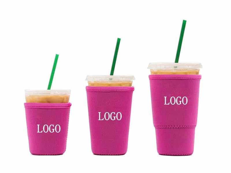
The correct size comes from the actual beverage container, not a generic “standard can” description. Confirm height, body diameter, top and bottom dimensions before developing the pattern. Then choose a foldable or cylindrical structure and an appropriate neoprene thickness. For many promotional projects, 3 mm neoprene provides a useful balance of flexibility, shape, insulation, printability, packing efficiency, and cost.
Confirm the Beverage Format
“Standard can” is convenient marketing language but an incomplete manufacturing specification. Beverage containers differ by country, brand, category, and volume. A 330 ml can may not share the same dimensions as a 355 ml can, and slim energy-drink or hard-seltzer cans are noticeably narrower and taller than conventional soda or beer cans. Tall cans, bottles, and specialty containers create additional pattern requirements.
The safest development reference is a physical can supplied to the manufacturer. When sending the container is impractical, provide a verified technical drawing with the total height, main body diameter, top diameter, and bottom diameter. Photographs and product links can support the discussion, but they should not replace measurements because perspective and image scaling can be misleading.
The finished sleeve must remain secure without making insertion difficult. A cooler that is too loose can rotate or slide, causing the logo to face away from the viewer. A product that is too tight can stretch the artwork, place excessive stress on the seam, and frustrate users. Neoprene elasticity should refine the fit, not compensate for an inaccurate pattern.
Fit testing should use the actual filled can or a weighted equivalent. An empty container is lighter and may create an unrealistic impression of handling. Insert and remove the can repeatedly to check stretch recovery, seam stability, edge movement, and whether the cooler becomes loose after normal use. When a campaign serves several container formats, separate sizes usually produce a more professional result than one universal sleeve.
Compare Structure Options
A foldable can cooler lies relatively flat when empty and takes shape after the beverage is inserted. This structure is widely used for trade shows, festivals, direct-mail campaigns, beverage sampling, and high-volume event distribution because it is compact, easy to pack, and convenient for recipients to carry in a pocket or bag.
A cylindrical cooler has a more defined form and often includes a closed or reinforced bottom. It may stand upright before use and can create a more substantial presentation in gift boxes, retail displays, premium alcohol campaigns, or corporate hospitality programs. The trade-off is greater shipping and storage volume, which becomes significant when thousands of units are distributed across multiple venues.
Open-bottom, flexible-bottom, and closed-bottom constructions should not be treated as simple quality levels. Each has a suitable application. A basic open or flexible structure may reduce material, weight, and production complexity. A closed bottom provides fuller coverage and a more finished appearance but requires additional material and sewing. The decision should reflect campaign positioning and use rather than an assumption that the most complicated option is always better.
Custom-shaped edges, finger openings, curved panels, or mascot-inspired outlines can strengthen brand recognition. However, every structural change affects pattern development, artwork placement, cutting accuracy, sewing speed, and production consistency. Large campaigns usually benefit from simple, repeatable construction unless the custom shape creates an obvious marketing advantage.
| Specification | Common options | Practical decision factor |
|---|---|---|
| Beverage format | Standard, slim, tall, bottle | Match the actual container dimensions |
| Construction | Foldable or cylindrical | Balance distribution efficiency and presentation |
| Bottom style | Open, flexible, closed, reinforced | Consider coverage, appearance, and sewing cost |
| Neoprene thickness | 2 mm, 3 mm, 4 mm, 5 mm | Adjust structure, flexibility, and hand feel |
| Surface | Polyester-laminated or other fabric finish | Match the selected printing process |
| Decoration area | One side, two sides, full wrap | Match artwork complexity and visibility |
| Edge profile | Straight, curved, custom shaped | Use only when it strengthens the concept |
Select a Practical Thickness
Neoprene can coolers are commonly developed between approximately 2 mm and 5 mm. Thickness influences hand feel, flexibility, insulation, sewing behavior, packing density, shipping volume, and unit cost. A thicker material can feel more substantial, but it is not automatically the best option for every promotional program.
A 2 mm sleeve is light, flexible, and compact. It may suit large-scale campaigns where low storage volume and economical distribution are priorities. However, it generally provides less structure than thicker alternatives. A 3 mm construction is a common starting point because it balances flexibility, shape retention, surface support, and packing efficiency for many beverage promotions.
A 4 mm option creates a more substantial feel and may suit premium brand programs, selected retail merchandise, or customer gifts. It also uses more material and carton space. A 5 mm cooler may be appropriate for specialized products, but it can be unnecessarily bulky for a simple giveaway that recipients are expected to fold and carry.
Nominal thickness alone does not completely describe performance. Foam density, surface lamination, elasticity, stretch direction, and material consistency influence the result. Two samples both described as 3 mm neoprene may feel noticeably different. Buyers who care about hand feel should review actual swatches and a finished sample rather than approving the material from a written description alone.
Add Features with a Purpose
Custom accessories can improve function and create a more distinctive product, but every feature should solve a real campaign problem. A bottle opener may support a beer promotion. A carrying loop may be useful at outdoor festivals. A magnet can work for workshops, tailgates, home bars, or garage environments. These features offer less value when they do not match the recipient’s behavior.
Other possibilities include contrasting stitching, a reinforced bottom, shaped edges, woven labels, rubber patches, clips, zippers, and printed packaging. Each addition affects more than the unit price. It may require another material supplier, attachment process, inspection point, production tool, or packaging adjustment. Metal components also increase weight and may need protection from scratches.
The campaign team should ask whether recipients will use the feature, whether it improves recognition, whether it can be reproduced consistently, and whether it changes the shipping volume. A basic cooler with accurate fit, strong artwork, and clean stitching can feel more professional than an overloaded product with several low-value accessories.
Premium positioning does not always require more components. Better neoprene, controlled printing, balanced proportions, thoughtful packaging, and a reliable fit often create a stronger impression. When the budget is fixed, improving the core product may generate more value than adding a feature that recipients rarely notice.
How Should You Prepare the Artwork?
Artwork should be built on the manufacturer’s real production template rather than a generic rectangle. Keep essential logos, text, dates, and QR codes inside a protected safe area away from seams and edges. Supply vector files, outlined fonts, color references, bleed, and controlled version codes. Full-wrap graphics and QR codes must be tested on the assembled cooler placed around the intended can.
Build a Clear Visual Hierarchy
A can cooler offers less visible space than the flat design file suggests. When the sleeve wraps around a cylindrical container, only part of its circumference faces the viewer. A logo that appears moderate on a monitor can wrap too far around the sides, while text that appears readable at 200% zoom may be difficult to recognize in a real event environment.
Choose one dominant element, such as the brand logo, product name, campaign phrase, or event identity. Supporting information may include a short call to action, date, website, sponsor mark, or social handle. The primary message should be understandable within a few seconds, because most recipients first see the cooler while walking, queuing, talking, or receiving several promotional products.
A paper mockup is a simple but useful approval tool. Print the artwork at actual size, trim it approximately, and wrap it around the correct can. This test reveals whether the main logo remains within the front-facing area, whether the composition feels balanced, and whether secondary information disappears around the sides.
The front and back can serve different purposes. The front may carry the strongest brand identity, while the back contains a QR code, short URL, campaign date, or sponsor line. This approach reduces visual competition. Typography should remain clear, with adequate stroke weight and spacing. Thin scripts, highly condensed type, and long uppercase phrases may require physical testing before approval.
Protect the Safe Area
The production template should identify the cut line, seam allowance, stitch line, bleed, and safe area. These zones serve different purposes. Background colors, photographs, and textures should extend into the bleed so trimming does not leave an unprinted edge. Logos, text, dates, and other essential elements should remain within the safe area.
The seam is a construction requirement and an important design boundary. Artwork crossing the seam may be interrupted by thread, hidden inside the allowance, distorted by stretch, or misaligned during sewing. Small text, faces, QR codes, and geometric graphics are especially sensitive because even a slight shift is easy to notice.
Top and bottom edges also need clearance for cutting and sewing. Critical text positioned too close to an edge may look uneven even when the finished product remains within reasonable manufacturing tolerances. Designers should allow the manufacturer to move the pattern slightly without damaging the message.
Continuous stripes, grids, and illustrations that must meet perfectly at the back seam are difficult to reproduce consistently. An organic pattern can tolerate minor movement, while a broken straight line appears immediately incorrect. A practical solution is to place a neutral background, texture, or less critical part of the artwork near the seam rather than making exact edge alignment essential.
| Artwork element | Recommended treatment | Main production risk |
|---|---|---|
| Primary logo | Keep inside the front-facing safe area | Excessive wrapping and reduced visibility |
| Small text | Use clear type, adequate weight, and contrast | Filling, blurring, or unreadability |
| Background image | Extend through the bleed | Unprinted edges after cutting |
| QR code | Place on a stable, high-contrast area | Curvature, stretch, or seam interference |
| Sponsor logos | Group with consistent spacing and scale | Crowding and weak hierarchy |
| Repeating pattern | Build tolerance into the seam area | Obvious pattern breaks |
| Full-wrap illustration | Plan around the finished seam position | Misalignment of important elements |
Manage Color and File Quality
Vector artwork is preferred for logos, icons, line graphics, and typography because it can be scaled without losing clarity. AI, EPS, and editable PDF files are commonly used for production. Fonts should be converted to outlines so the appearance does not change when the file is opened on another computer or by another production system.
Photographs and texture files should have sufficient resolution at the actual print size. Enlarging a small image copied from a website does not create additional detail. Compressed messaging-app images, screenshots, and logos taken from presentation slides often delay proofing because they require redrawing or replacement.
A complete artwork package should include the editable source file, outlined-font version, linked high-resolution images, Pantone references when applicable, print dimensions, front and back identification, artwork code, and revision date. Only final approved files should be placed in the production release folder.
Color requires physical evaluation because monitors display RGB light while printing depends on ink, heat, material surface, lamination, and lighting. Pantone references help define the target, but not every shade reproduces identically on every substrate or with every printing method. A dark material can also reduce contrast, while sublimation normally relies on a compatible white or light polyester surface.
Approve important colors on a physical sample under suitable lighting. The goal should be consistent commercial reproduction against the approved reference rather than an unrealistic expectation that every material, batch, and viewing condition will appear mathematically identical.
Test Full-Wrap Designs and QR Codes
Full-wrap artwork works well for photographs, gradients, illustrated landscapes, sports themes, repeating graphics, and packaging-inspired visuals. It allows the entire cooler to contribute to the campaign rather than limiting decoration to a small logo area. However, a full-wrap background does not remove the need for a clearly defined primary viewing angle.
The main logo or message should still remain within a recognizable front-facing area. The remainder of the surface can support the visual story. Designers should provide sufficient bleed and avoid placing important faces, text, sponsor marks, or product details where they depend on exact seam alignment.
QR codes need additional testing because the printed surface is flexible and curved during use. The code should use strong contrast, retain a clear quiet zone, and remain away from seams, edges, and heavily stretched areas. Excessive graphic customization can reduce reliability, particularly when the module pattern becomes decorative rather than functional.
Give the recipient a reason to scan. Phrases such as “Enter to Win,” “Claim Your Offer,” or “View the Event Menu” provide more motivation than an unexplained code. Test the finished sample with several phone models, in daylight and indoor lighting, and from realistic angles. A code that works on a flat digital proof may fail after the neoprene is stretched around the beverage.
Which Printing Method Is Best?
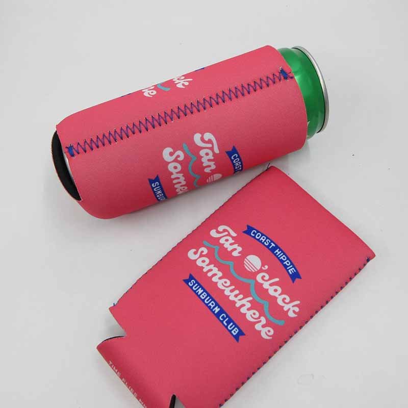
Screen printing generally suits bold, limited-color logos; heat transfer supports detailed multicolor graphics; and sublimation is often best for photographs, gradients, and full-wrap designs on compatible polyester-laminated neoprene. The right method depends on artwork complexity, base material color, order quantity, print coverage, desired hand feel, durability expectations, setup costs, and the appearance of the approved physical sample.
Use Screen Printing for Bold Graphics
Screen printing is a practical option for simple promotional artwork. Ink is applied through a prepared screen, and each color normally requires a separate setup. The method works well with one-color or two-color logos, large solid shapes, clear typography, and repeat corporate programs where the design remains stable across a meaningful quantity.
It becomes less efficient when the artwork contains photographs, smooth gradients, or many colors. Each additional color may require another screen, registration step, and production check. Small reversed text and extremely fine lines can also be difficult to reproduce on a flexible textile surface, particularly when the material texture is more visible.
Neoprene stretches when the beverage is inserted, so the selected ink and curing process should support normal movement. A very heavy printed area can feel stiffer than the surrounding material and may show stress if the design is repeatedly stretched. The production sample should therefore be evaluated both flat and around the intended can.
Design adjustments can improve consistency without weakening the brand. Increasing a thin line slightly, opening small spaces, or simplifying a complicated mark may produce a cleaner result. Screen printing is often the most sensible choice when the campaign needs a strong, recognizable logo rather than complex decorative coverage.
Choose Heat Transfer for Detailed Logos
Heat transfer can reproduce multicolor logos, gradients, detailed illustrations, and artwork that would be inefficient to separate into several screen-printing colors. The graphic is prepared on a transfer medium and applied using controlled temperature, pressure, and time. This approach is useful for smaller detailed areas, multiple campaign versions, and designs that need more complexity than a basic spot-color print.
Process control matters because excessive heat or pressure can affect the neoprene surface, fabric lamination, elasticity, or appearance. Insufficient heat can cause weak bonding or lifting edges. The manufacturer should establish the correct settings for the exact material rather than assume one transfer condition suits every neoprene construction.
Large solid transfers may feel stiffer than the surrounding fabric. When the cooler stretches, the transfer must move without cracking, separating, or forming unattractive edges. Artwork covering a large percentage of the surface may therefore be better suited to sublimation when the material and color requirements allow it.
The physical sample should be placed on the correct can and repeatedly inserted and removed. Inspect the edge adhesion, color, texture, and flexibility after movement. A transfer that looks perfect while lying flat is not fully approved until it has been tested under the same stretch and handling conditions recipients will create during the campaign.
Use Sublimation for Full Color
Sublimation is commonly selected for full-color illustrations, photographs, gradients, repeating patterns, and edge-to-edge artwork. The design is transferred under heat into a compatible polyester surface, allowing the color to become part of the printable textile rather than forming a thick layer on top.
This process usually preserves a smooth hand feel and natural flexibility, which is valuable for a sleeve that stretches around a can. It also supports detailed campaign artwork that would require many separate screens or transfers. However, sublimation normally performs best on white or light polyester-laminated neoprene because the inks are transparent rather than opaque.
The base color influences the printed result. Light graphics cannot be sublimated onto black neoprene in the same manner as an opaque screen ink. Large areas of exact corporate color should still be sampled because heat conditions, fabric, ink profiles, and digital color conversion can change the final appearance.
Full-wrap sublimation also requires controlled bleed and a realistic seam strategy. Faces, logos, typography, and QR codes should not depend on perfect alignment at the back. Sublimation is not automatically the premium choice for every project. A simple one-color logo may be produced more efficiently through screen printing, while the full-color process creates the greatest value when the artwork genuinely uses its capabilities.
| Printing method | Best suited to | Main advantages | Main limitations |
|---|---|---|---|
| Screen printing | Bold logos and limited colors | Strong solid color and practical bulk production | Less suitable for photos and many colors |
| Heat transfer | Detailed multicolor spot graphics | Good detail and flexible artwork variation | Large areas may feel stiffer |
| Sublimation | Photos, gradients, patterns, full wrap | Smooth hand feel and detailed color coverage | Requires a compatible light polyester surface |
| Woven label | Small textile branding detail | Durable sewn identity and premium appearance | Fine details are limited at small sizes |
| Rubber patch | Raised tactile logo | Distinctive three-dimensional appearance | Higher cost, weight, and attachment requirements |
Approve Proofs and Samples
A digital proof confirms the artwork version, position, dimensions, print sides, seam relationship, material, printing method, quantity, and production notes. It should show both the flat layout and a visual mockup of the assembled cooler so the customer can understand how the artwork wraps around the can.
Every word, date, URL, sponsor mark, trademark symbol, and QR-code destination should be checked carefully. Production can reproduce an approved spelling error just as consistently as it reproduces correct artwork. The approval should be recorded in writing and linked to a clear revision number.
Digital proofs cannot fully communicate material feel, color under real lighting, print texture, stretch, fit, seam quality, or edge finishing. A physical sample is therefore important when the project includes strict brand colors, full-wrap graphics, custom construction, QR codes, new materials, accessories, or a substantial order quantity.
Review the sample on the actual beverage can rather than on a desk. Check the logo from normal viewing angles, photograph it in realistic lighting, scan the QR code, and handle it repeatedly. Retain a dated approval reference where practical. Bulk inspection should compare finished products with that reference rather than with unrecorded comments or memories of earlier samples.
How Do You Control Bulk Production?
Reliable bulk production depends on an approved physical sample, a written specification, controlled artwork versions, staged inspections, and a schedule built backward from the required arrival date. Material, dimensions, printing, sewing, packaging, quantities, and carton markings should be confirmed before production. Checking first printed panels and first sewn units prevents a small setup error from affecting thousands of finished coolers.
Lock the Production Specification
A physical sample is a strong reference, but it cannot record every commercial and logistical requirement. The production specification should document the beverage format, finished dimensions, neoprene type, thickness, lamination, construction, bottom style, artwork code, color references, printing method, seam position, stitch color, packaging, quantity by version, carton packing, inspection standard, and delivery information.
Changes after material printing or cutting can create waste and delay. Internal stakeholders should therefore complete artwork, legal, sponsor, and campaign approvals before production is released. One authorized person should provide the final instruction so the manufacturer does not receive contradictory comments from an agency, distributor, marketing team, and event organizer.
A clear specification also protects repeat orders. When the campaign returns the following season, the approved pattern, material, artwork size, packing quantity, and quality reference can be retrieved rather than rebuilt from memory. Any intended change can then be identified clearly instead of accidentally modifying a successful product.
The production file should include the approved digital proof, sample photographs, revision history, and packaging instructions. Requirements discussed only during calls or scattered across messaging applications are easier to misunderstand. Consolidating them into one controlled document reduces interpretation and creates a more reliable basis for inspection.
Inspect at Critical Stages
Final inspection is necessary, but waiting until every cooler is finished is an inefficient way to control quality. The most valuable inspections occur before a problem spreads. Incoming neoprene should be checked for thickness, surface appearance, color, lamination, odor, contamination, and consistency before printing and cutting begin.
The first printed panels should be reviewed for artwork scale, orientation, clarity, color, and process performance. After cutting, inspectors should check panel dimensions and the relationship between the print area and seam allowance. The first sewn units should be assembled and fitted to the correct beverage can before the sewing line continues at full speed.
Finished inspection should verify artwork version, logo position, text readability, QR-code function, color consistency, can fit, seam strength, edge finishing, loose threads, stains, odor, packaging, quantity, and carton identification. Wrong artwork, failed QR codes, incorrect fit, open seams, and mixed design versions should be treated as more serious than minor cosmetic variation that does not affect function or brand presentation.
Flexible products require a consistent measurement method. The neoprene should not be pulled differently each time the size is checked. Inspectors should use the same reference points, flat surface, and handling procedure. Fit inspection should include both insertion and removal because a sleeve that technically accepts the can may still be uncomfortable in real use.
Plan MOQ, Cost, and Variations
The quotation depends on more than material thickness. Product structure, pattern yield, printing method, artwork coverage, number of designs, custom colors, accessories, packaging, labels, testing, quantity, and delivery schedule all influence production cost. Two coolers that look similar in photographs can therefore have significantly different specifications.
Custom neoprene can cooler projects often begin around 500 pieces, although the practical minimum can vary according to material availability, printing setup, custom colors, packaging, and the number of artwork versions. A total order of 5,000 units divided across twenty designs does not create the same efficiency as one 5,000-piece design.
Buyers should provide quantity by version before requesting a final quotation. A simple foldable sleeve with one screen-printed logo is operationally different from a full-wrap sublimated cooler with several city designs, individual bags, barcode labels, and separate carton allocations.
Cost comparisons should use identical specifications. A lower offer may reflect thinner neoprene, less printing coverage, bulk packaging, wider tolerances, or fewer inspection stages. The lowest unit price is not always the lowest campaign cost. Incorrect fit, delayed delivery, mixed designs, repacking work, color complaints, or an unusable QR code can create losses that exceed the initial saving.
When the budget is limited, simplify the product intelligently. Reduce artwork versions, use a proven standard structure, select an available material color, choose practical bulk packaging, or concentrate the design on one strong logo. Removing unnecessary complexity usually protects quality more effectively than forcing every production element toward the lowest possible cost.
Build the Schedule Backward
The timeline should start with the date the campaign team needs physical control of the products, not the public event date. Additional time may be required for warehouse receiving, inspection, repacking, gift-set assembly, distribution to venues, and internal coordination. A delivery arriving the day before an event may technically be on time but operationally unusable.
A standard neoprene can cooler sample may take approximately 5–7 days after the material, dimensions, and artwork are confirmed. Bulk production may commonly require around 15–30 days, depending on quantity, printing method, material preparation, packaging, version count, and factory scheduling. These planning ranges do not include every sample shipment, revision, freight booking, customs process, or local delivery.
| Project stage | Typical planning range | Main control point |
|---|---|---|
| Requirements and artwork preparation | 2–7 days | Complete dimensions and final source files |
| Quotation and technical review | 1–3 days | Confirm feasibility and cost factors |
| Digital proof and revisions | 2–5 days | Written artwork approval |
| Standard physical sample | Approximately 5–7 days | Check fit, color, print, seam, and packaging |
| Sample shipping and review | Destination-dependent | Complete final physical approval |
| Bulk production | Approximately 15–30 days | Conduct staged process inspections |
| Final inspection and packing | Project-dependent | Verify versions, quantities, and cartons |
| International freight | Shipping-method dependent | Choose courier, air, sea, or DDP |
| Customs and local distribution | Destination-dependent | Keep a buffer before the campaign |
Peak seasons, custom material colors, complex packaging, repeated revisions, unusual accessories, and many artwork variations can extend the schedule. Removing the physical sample to recover lost time usually transfers schedule pressure into product risk. A better solution may involve simplifying the artwork, using an available material, reducing design versions, choosing faster packaging, or splitting urgent and standard deliveries.
A complete RFQ should include the beverage dimensions, product structure, quantity by design, artwork files, neoprene preference, printing expectations, packaging, destination, and required arrival date. Szoneier supports custom neoprene can cooler projects with material review, sample development, printing coordination, sewing production, inspection, packaging, and export delivery. The company’s broader manufacturing system is based on more than 18 years of custom bags and soft-goods experience, with project control covering material selection, sampling, production, quality inspection, and international shipment.
A promotional can cooler succeeds when the campaign concept and manufacturing details support each other. The marketing team defines what recipients should notice and do. The designer turns that objective into a clear visual system. The manufacturer confirms that the can size, neoprene, structure, printing, seam position, packaging, and schedule can be reproduced consistently across the full order.
The most important decisions happen before bulk production. Confirm the exact beverage container, keep essential artwork away from seams, select printing according to the design rather than habit, test a physical sample, control every artwork version, and plan backward from the required arrival date. These steps reduce the likelihood of unreadable text, weak color contrast, incorrect fit, mixed designs, repacking work, and missed events.
Szoneier works with beverage brands, promotional-product companies, event agencies, retailers, distributors, corporate-gift teams, and commercial buyers that require custom neoprene can cooler development and bulk manufacturing. To request a project review, send the can dimensions, artwork, quantity, material preference, packaging requirements, destination, and required delivery date to info@szoneier.com, or contact the project team through WhatsApp at (+86) 13423847456.
A complete request allows the manufacturing team to review fit, artwork position, material, printing, packaging, production timing, and delivery risks before preparing the sample plan and quotation. This early technical review is often the difference between a promotional item that merely carries a logo and a campaign product that looks professional, arrives on schedule, and continues representing the brand long after the event.