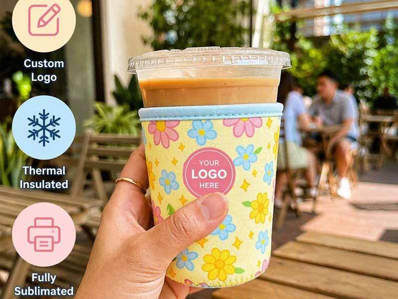
A full-color neoprene koozie may look like one of the simplest products in a promotional collection, yet it combines textile printing, flexible foam behavior, pattern engineering, cutting, sewing, fit control, packaging, and color management in one compact item. A design that looks perfect on a computer screen can become distorted when the sleeve stretches around a can, disappear into a side seam, or print differently on an unsuitable laminated surface.
Brands should evaluate five factors before ordering full-color neoprene koozies: the foam and laminated fabric, the printing method, the artwork setup, the finished product specifications, and the supplier’s bulk-production controls. Sublimation is usually the strongest option for photographs, gradients, detailed illustrations, and full-bleed graphics, but reliable results still require production templates, color samples, fit testing, approved prototypes, and measurable quality standards.
Many preventable failures begin with approving a digital rendering instead of an actual production sample. One brand may receive sleeves with a sponsor name hidden by stitching, while another discovers that a standard-can pattern rotates loosely around a slim beverage can. These are not mysterious factory accidents. They are predictable outcomes when graphic design, material selection, pattern construction, and production control are treated as separate decisions rather than one connected system.
What Are Full-Color Neoprene Koozies?
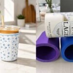
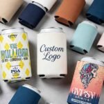
Full-color neoprene koozies are flexible insulated beverage sleeves made from foam rubber laminated with printable fabric. They can display photographs, gradients, multicolor illustrations, repeating patterns, and edge-to-edge branding. Their final quality depends on foam thickness, fabric construction, printing compatibility, panel dimensions, seam placement, bottom design, stretch recovery, and how closely bulk production follows the approved physical sample.
A koozie should not be evaluated only as a printable promotional blank. It is a sewn soft-goods product in which the surface fabric carries the visual identity, the foam core supplies flexibility and light insulation, the pattern determines fit, and the stitching controls the final shape. A weakness in any one of these elements can reduce the perceived quality of the entire product, even when the artwork itself is attractive.
The term “neoprene koozie” is also used loosely in the marketplace. Some products use genuine neoprene-based foam, while others use alternative synthetic rubber or promotional foam blends. Buyers should therefore request a written material specification instead of relying on the product name alone. The approved sample should represent the proposed bulk material, including its surface fabric, thickness, elasticity, odor, density, color, lamination, and recovery after stretching.
| Construction Item | Common Options | Practical Effect | Buyer Verification |
|---|---|---|---|
| Foam thickness | 2 mm, 3 mm, 4 mm, 5 mm | Changes flexibility, structure, insulation, weight, packing volume, and cost | Confirm whether the number refers to the foam or total laminated sheet |
| Outer surface | Smooth polyester, textured polyester, polyester blend | Influences sublimation brightness, detail, and hand feel | Approve the exact fabric used for bulk production |
| Inner surface | Fabric laminated, plain foam, colored textile | Affects appearance, comfort, lamination stability, and odor perception | Review a cut edge and completed sample |
| Side construction | Overlock seam, flat seam, bound seam | Influences durability, seam width, and artwork interruption | Confirm seam location and thread color |
| Bottom design | Folding bottom, open bottom, circular sewn base | Changes fit, stability, packing, and artwork visibility | Test the real can inside the finished sample |
| Print coverage | Front only, two-sided, all-over, full bleed | Determines artwork flexibility and file requirements | Confirm printable area, bleed, and safe zone |
How Are They Constructed?
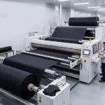
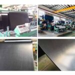
A typical full-color koozie begins with a flexible foam sheet laminated to textile on one or both surfaces. The visible face is commonly a light polyester fabric because polyester accepts sublimation dyes more effectively than untreated rubber foam. The inner face may use another laminated textile or a simpler finish, depending on the required appearance, product positioning, cost, and handling expectations.
The printed sheet is cut into production panels rather than simply rolled into a tube. A collapsible sleeve may use one shaped body panel and a folding base, while a fitted cylindrical model can use a rectangular side wall and a separate circular bottom. These constructions require different patterns, sewing operations, artwork layouts, tolerances, packing methods, and quality checks.
The side seam consumes part of the printed panel and compresses the material under stitching. The bottom structure can also fold, curve, or hide portions of the artwork. This is why an attractive flat artwork file may not look balanced on an assembled product. The design must be reviewed on the actual cutting template and then tested around the intended beverage container.
A complete specification should identify the foam composition, nominal thickness, outer fabric, inner finish, finished dimensions, seam type, edge treatment, bottom design, print coverage, artwork revision, and packaging. Without these details, two quotations for an apparently identical 3 mm koozie may describe products with very different material feel, color brightness, fit, seam quality, and expected service life.
Is Full Color the Same as Sublimation?
Full color describes what the buyer sees, while sublimation describes one method used to produce that visual result. A full-color image may contain photographs, shadows, gradients, fine patterns, illustrations, and numerous color transitions. Sublimation is often selected because it can transfer the complete image into a polyester surface without requiring a separate screen for every visible color.
During sublimation, special dye is first printed in reverse onto transfer paper. Controlled heat and pressure convert the solid dye into gas, allowing it to enter the polyester fibers. As the material cools, the color becomes locked into the textile. The result normally feels smoother than a thick surface print and is less likely to crack when the fabric stretches.
Sublimation dye is generally transparent, which means the base fabric supplies the brightness behind the image. White or light polyester usually produces the clearest and most vivid output. Printing the same artwork on an off-white, gray, textured, or darker surface can produce a visibly different result, even when the digital file and equipment settings remain unchanged.
Not every product advertised as full color uses sublimation. Heat-transfer film, printable vinyl, digital transfer, direct textile printing, and other systems may also be described as full-color processes. Buyers should confirm the exact method, printable surface, expected hand feel, stretch performance, sample process, and whether the same method will be used for the production order.
Why Do Brands Choose Neoprene?
Neoprene is popular because it combines flexibility, cushioning, light insulation, and a broad branding area in a product that remains compact enough for economical distribution. The sleeve can reduce direct contact with a cold, wet can, slow temperature change to a limited degree, and provide a more substantial hand feel than very thin promotional foam.
From a marketing perspective, a koozie remains visible while the user is drinking, talking, attending an event, or taking photographs. It may appear on restaurant tables, festival grounds, outdoor gatherings, social media posts, office desks, retail displays, or sports venues. This repeated exposure gives the product greater practical branding value than many disposable promotional materials.
Neoprene can also support different price and positioning levels. A simple folding model with a basic logo may suit a high-volume campaign, while an all-over printed design with refined edge finishing, custom labels, and retail packaging can become licensed merchandise or a permanent part of a lifestyle collection. The same material category can therefore serve both promotional and retail objectives.
Brands should nevertheless describe performance responsibly. A neoprene sleeve is not equivalent to a vacuum-insulated tumbler. Its effect depends on thickness, fit, beverage temperature, ambient conditions, exposure time, and user behavior. Claims such as keeping a drink cold for a precise number of hours should only be used when supported by a defined test conducted under repeatable conditions.
Are All Neoprene Koozies the Same?
Two koozies with the same printed design and quoted thickness can differ in foam density, softness, recovery, fabric texture, lamination, odor, stitch quality, dimensional accuracy, and fit. These differences are difficult to judge from a quotation spreadsheet or product photograph, which is why experienced buyers compare representative physical samples before approving a commercial order.
Nominal thickness is useful, but it is not a complete measure of quality. A dense 3 mm foam may feel firmer and more supportive than a softer 4 mm sheet. Suppliers may also measure the foam core alone or the complete fabric-laminated structure. Compression during measurement can create further variation unless the method is agreed.
Stretch recovery is especially important because the product expands during insertion and removal. Material that is too soft may become loose or distorted after repeated use. Material that is too stiff can require excessive insertion force, overload the seam, prevent the bottom from opening fully, and stretch the printed image until colors appear lighter.
A practical comparison should include repeated insertion, seam stretching, edge inspection, folding, odor review, and observation of shape recovery. Buyers should also check whether the lamination begins separating near cut edges and whether the print surface develops shine or unevenness. These simple physical checks reveal product differences that cannot be captured by marketing descriptions alone.
Which Printing Method Works Best?
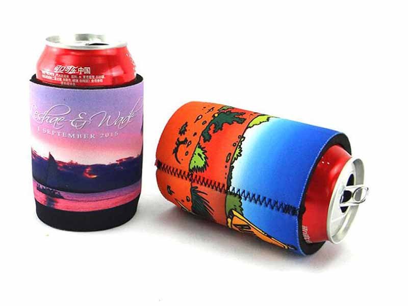
Dye sublimation usually works best for photographs, gradients, detailed illustrations, multicolor patterns, and full-bleed designs on polyester-laminated neoprene. Screen printing remains practical for bold logos and a limited number of spot colors, particularly at larger quantities. Heat transfer and digital transfer can support specialized applications, but the correct method depends on artwork, substrate, stretch, durability, order volume, and budget.
The strongest printing choice begins with the design and commercial purpose rather than with whichever process is easiest for the supplier. A one-color corporate mark for a large conference has different requirements from a photographic retail design, a licensed illustration, or a repeating sports pattern. The first project may prioritize cost and speed, while the second requires color detail and broad coverage.
The surface fabric must also support the chosen process. Sublimation generally requires a compatible polyester-rich face, while screen printing requires an ink system that adheres to the textile and remains flexible. Transfer methods add another layer to the surface and must be checked for edge lifting, stiffness, adhesive performance, and changes caused by folding or stretching.
| Printing Method | Best-Suited Artwork | Main Advantage | Main Limitation | Typical Use |
|---|---|---|---|---|
| Dye sublimation | Photos, gradients, illustrations, all-over patterns | Smooth full-color output with broad coverage | Requires a compatible light polyester surface | Retail designs, licensed graphics, colorful brand campaigns |
| Screen printing | Simple logos, bold text, one to four spot colors | Strong solid color and efficient repeat production | Setup increases as color count rises | Corporate promotions, breweries, events, sports programs |
| Heat transfer | Names, small graphics, variable information | Flexible for selected placements and short runs | Can create a visible surface layer | Personalization and event-specific versions |
| Digital transfer | Detailed localized multicolor artwork | Avoids separate screens for every color | Film and adhesive performance vary | Smaller campaigns and specialty placements |
| Woven or rubber label | Secondary brand detail | Adds texture and premium physical identity | Cannot create full-surface imagery | Retail collections and product upgrades |
How Does Sublimation Work?
Sublimation begins with a mirrored image printed on transfer paper using specialized dye. The paper is placed against the polyester-laminated neoprene, and the combination is exposed to controlled temperature, pressure, and dwell time. The dye changes into gas, enters the polyester fibers, and becomes part of the textile surface as the material cools.
Every production variable influences the outcome. Insufficient heat can create pale color, incomplete transfer, or weak detail. Excessive heat can compress the foam, alter its hand feel, create surface shine, or affect the laminated structure. Uneven pressure may result in lighter patches, particularly around panel edges or areas where the material thickness is inconsistent.
The white level, texture, and polyester content of the outer fabric affect brightness and sharpness. A smooth white knit usually produces cleaner photographic detail than a coarse or off-white textile. Dark areas and heavy ink coverage also need attention because shadow detail can close up or appear uneven if the print profile is not suited to the material.
Brands should evaluate an assembled sample rather than only a flat printed sheet. Stretching changes the spacing between fabric fibers and can make colors appear lighter. Faces, circles, narrow logos, and geometric patterns can also become wider when wrapped around a can. The representative sample should therefore use the proposed bulk material, print settings, cutting method, and sewing construction.
Is Sublimation Better Than Screen Printing?
Sublimation is generally stronger for complex images because the full design transfers as one process-color image. Photographs, gradients, shadows, illustrations, and multicolor patterns can be reproduced without preparing a separate screen for every visible shade. The printed surface remains relatively smooth because the dye becomes part of the polyester rather than sitting as a thick coating.
Screen printing can be more commercially efficient for one-color or two-color logos, simple text, and large promotional programs. Once the screens are prepared, the same design can be repeated effectively. Suitable inks can also create stronger opacity on certain fabric colors or surfaces where conventional sublimation would not produce the required result.
Durability should not be judged only by the process name. Sublimation normally resists cracking because no heavy surface layer is created, but color performance still depends on polyester quality, heat control, washing, abrasion, and exposure. Screen printing can remain durable when flexible ink and correct curing conditions are used, but unsuitable ink may crack as the sleeve stretches.
A fair comparison should use the same product dimensions, material, artwork area, quantity, packaging, and expected quality. Printing a small one-color logo through full-panel sublimation may add unnecessary handling, while converting a detailed photograph into multiple screen colors can increase cost and reduce visual accuracy. The better method is the one that preserves the design’s essential features with stable production economics.
When Should Brands Use Screen Printing?
Screen printing is well suited to designs built around recognizable solid-color elements. Corporate marks, event names, short slogans, brewery logos, sponsor graphics, and sports emblems often remain effective without photographic detail. A carefully positioned one-color print can provide stronger visual clarity than a complex image that becomes difficult to read from normal viewing distance.
Each spot color generally requires its own screen, alignment, and printing stage. A single logo is comparatively straightforward, while a six-color design requires more setup and creates additional registration risk. When the artwork contains many closely aligned colors, the process can become less efficient than sublimation and may not reproduce smooth gradients naturally.
Ink selection is essential because neoprene stretches during use. An ink formulated for rigid promotional products may feel stiff or crack when the sleeve expands around the container. The printing team should use an ink system suited to the laminated textile and cure it under conditions that do not damage the foam or adhesive layer.
Before approval, buyers should confirm printable dimensions, minimum line thickness, minimum text size, color target, seam clearance, opacity, stretch performance, and rub resistance. The sample should be inspected both flat and fitted around the target can because a centered print on a flat panel can shift visually when the product is stretched.
Do Heat Transfer and Digital Printing Work?
Heat-transfer and digital-transfer processes can work effectively for localized artwork, personalization, event dates, names, small quantities, or designs that would require too many traditional screen-printing setups. They may also produce bright graphics on certain darker surfaces by including an opaque printable layer that conventional sublimation does not provide.
The transferred graphic normally sits partly or fully above the textile surface. This can create a visible edge or a different hand feel from the surrounding fabric. A large transfer may stretch less freely than the neoprene beneath it, leading to wrinkling, lifting, or surface tension when the sleeve is placed around a container.
Temperature and pressure need careful control because neoprene foam can compress under heat. An attractive transfer on a flat swatch may not perform equally well after repeated folding, stretching, packing, and handling. Corners, narrow projections, and sharply cut edges are especially vulnerable to lifting when adhesive selection or application conditions are unsuitable.
The term “digital printing” should never be accepted without clarification because it can describe several different technologies. Buyers should request the exact film, ink, adhesive, and application method, along with a sample made through the planned bulk process. The sample can then be stretched repeatedly, folded, rubbed with a damp cloth, and inspected after several days.
Which Designs Need Full-Bleed Printing?
Full-bleed printing is appropriate when the visual design is intended to reach every edge of the finished sleeve. Repeating patterns, photography, camouflage, watercolor artwork, lifestyle scenes, licensed characters, branded color fields, abstract graphics, and sports imagery often look incomplete when surrounded by an accidental white or unprinted border.
Artwork must extend beyond the cutting line because printing, lamination, cutting, and sewing involve normal production movement. The extra image area allows the panel to shift slightly without exposing the base fabric. The required bleed depends on the cutting method, product shape, thickness, and sewing structure, so the supplier’s template should define it.
Important information should remain inside a safe zone. Sponsor names, logos, faces, dates, QR codes, and legal text should not be placed near trim lines, bottom folds, or side seams. Background textures and extended photographs can tolerate trimming, while critical content cannot be replaced once it disappears into the seam.
Perfect alignment across a sewn joint is not always realistic because flexible foam stretches and compresses under the sewing foot. Random natural patterns, clouds, foliage, and abstract artwork hide small movement more effectively than grids, circles, stripes, and faces. Designers can reduce risk by positioning the seam at the back and keeping the most important visual content on the front.
How Should Brands Prepare Artwork?
Brands should create artwork on the manufacturer’s final production template, using editable vector files for logos and high-resolution raster files for photography. Around 300 DPI at final size is a practical starting point. Designs also need supplier-defined bleed, safe areas around seams, clear front-and-back orientation, outlined fonts, controlled color references, and a physical sample whenever precise colors or alignment matter.
Artwork preparation is part of product development rather than a simple file-delivery step. A square social-media image, poster design, or packaging graphic rarely fits a curved, stretched, cut, and sewn sleeve without adjustment. The production pattern determines what becomes visible, what disappears into the seam, and how the design changes when the material expands.
The brand, designer, and factory should work from one controlled template. That file needs to identify the bleed line, cut line, seam allowance, safe zone, panel direction, bottom placement, and any areas that will fold or become less visible. Version control becomes particularly important when a project contains several flavors, sponsors, regions, or event dates.
| Artwork Item | Practical Starting Point | Production Risk | Best Approval Method |
|---|---|---|---|
| Logo and line art | AI, EPS, SVG, or editable PDF | Pixelated or uneven edges | Printed sample at final size |
| Photography | Approximately 300 DPI at final dimensions | Blurred detail and compression artifacts | Full-panel material sample |
| Color references | CMYK file plus Pantone or physical reference | Unexpected shade differences | Printed swatches on actual fabric |
| Bleed | Supplier-defined, often several millimeters | White edge after cutting | Template review and assembled sample |
| Safe zone | Keep critical content away from seams and folds | Hidden logos or unreadable text | Physical prototype |
| Fonts | Outlined or properly packaged | Font substitution or layout change | Approved PDF and production file |
| QR code | High contrast with a clear quiet zone | Scanning failure after curving or stretching | Scan the assembled product |
| Artwork versions | Clear SKU and revision naming | Incorrect front-back pairing | Approved version matrix |
Which File Formats Are Best?
Vector files are usually preferred for logos, typography, icons, and line drawings because they can be resized without losing edge quality. Adobe Illustrator, EPS, SVG, and editable PDF formats are commonly suitable. Fonts should be converted to outlines when appropriate, or the required font files should be supplied under suitable licensing terms.
Photographs, painted artwork, textures, and other pixel-based images are better supplied as PSD, TIFF, or high-resolution PNG files. JPEG may work for photography, but repeated compression can create blocks, halos, noise, and color degradation. Images downloaded from websites or social media rarely contain enough detail for large full-panel printing.
The file extension alone does not confirm quality. A small JPEG placed inside an Illustrator document remains a low-resolution image, and a PDF may contain either clean vector paths or a single flattened screenshot. The production team should check effective resolution, missing links, transparency, clipping masks, embedded profiles, and font handling.
The final artwork package should contain an editable production file, a flattened reference image, and a clearly named approved version. Front, back, bottom, top, and seam direction should be obvious. Names such as “BeverageCampaign_12oz_Design04_V6_Approved” reduce risk more effectively than ambiguous file names such as “final-new-corrected.”
What Resolution Is Required?
Approximately 300 DPI at final production size is a dependable starting point for photographic and raster artwork. A file may appear sharp when displayed at a small size on a computer, yet become visibly blurred after it is enlarged to cover the complete koozie panel. Enlarging the pixel dimensions through software cannot recreate details that were never present.
The required resolution also depends on the image content. Soft gradients and abstract textures may tolerate lower effective resolution, while faces, product photography, small labels, fine illustrations, QR codes, and narrow text demand more detail. The fabric texture and heat-transfer process can soften the edges even when the original file is technically sharp.
Designers should inspect the artwork at its actual printed size rather than relying on a zoomed-out screen view. Jagged edges, compression blocks, noisy shadows, artificial sharpening, and fuzzy logos are warning signs. Small text should be printed as a test because a high-resolution file cannot compensate for lettering that is physically too small for the textile and process.
QR codes require particular attention. The code needs high contrast, a clear quiet zone, sufficient physical size, and placement away from seams or folds. It should be tested on the completed koozie after the sleeve is stretched around the intended can, using several phones and normal lighting conditions.
How Should Color Be Managed?
Color management begins by recognizing that a digital monitor and printed fabric produce color differently. A monitor emits light, while textile reflects it. Display brightness, calibration, polyester whiteness, surface texture, ink profile, heat settings, and room lighting can all make the same digital color appear different on the completed product.
CMYK artwork is generally more useful for process-color production than RGB artwork, although the factory may convert the file through its own color workflow. Pantone references can communicate important brand targets, but sublimation still uses a process-color system. Some fluorescent, metallic, or exceptionally saturated colors cannot be reproduced accurately through standard sublimation.
For critical colors, the supplier should print several nearby variations on the exact proposed neoprene surface. The buyer can then select the closest practical result under normal viewing conditions. This swatch becomes a stronger reference than a color viewed on a laptop screen or printed on ordinary office paper.
Color tolerance should be agreed before bulk production. Minor differences can occur between material lots, print runs, viewing angles, and lighting environments. The objective is a stable commercially acceptable range rather than an unrealistic promise of absolute identity. The approved swatch, assembled sample, material specification, and inspection lighting together create a usable production standard.
Do Designs Need Bleed?
Full-surface artwork needs bleed extending beyond the final cutting line. This extra visual area compensates for normal movement during printing, lamination, cutting, and sewing. Without sufficient bleed, even a small positional shift can create a narrow unprinted strip that becomes highly visible against a white polyester base.
The required allowance should come from the supplier’s production template rather than a universal online recommendation. Product shape, material thickness, manual or automated cutting, seam construction, and bottom design can change the required value. Several millimeters may be common, but the actual project specification should control the file.
Bleed should contain background material that can be trimmed without harming the communication. Colors, photographs, textures, and repeating patterns should extend beyond the trim line, while logos, product names, dates, legal statements, and faces should remain inside the safe zone.
The bottom area requires separate review because a folding panel may become compressed, partly hidden, or distorted when the can is inserted. A flat digital image does not show these changes accurately. The production template should identify fold lines, visible zones, seam consumption, and areas where critical artwork should not be placed.
How Do Seams Affect Artwork?
A seam interrupts the visual surface because part of the printed panel is folded, compressed, and joined with thread. The finished visible width is therefore smaller than the flat cut width. Flexible foam can also stretch under the sewing foot, creating small positional differences that would be unusual in rigid packaging or paper printing.
Critical graphics should not cross the seam. Faces, QR codes, circles, fine text, symmetrical shapes, and important sponsor marks reveal even minor misalignment. Gradients, scattered icons, foliage, clouds, camouflage, and random textures are more tolerant because the viewer does not expect exact line-to-line continuity.
Thread and binding colors also contribute to the finished design. A contrasting overlock stitch can become an intentional border, while a matching color makes the joint less prominent. Binding creates a wider visual edge and needs to be included in both the artwork review and the approved physical sample.
When continuity matters, the seam can often be positioned at the back while the front remains visually clean. The approval process should establish a realistic seam appearance rather than an impossible expectation of perfect mathematical matching. The buyer should inspect the product from normal viewing distance while it is wrapped around the intended can.
Which Product Specs Matter?
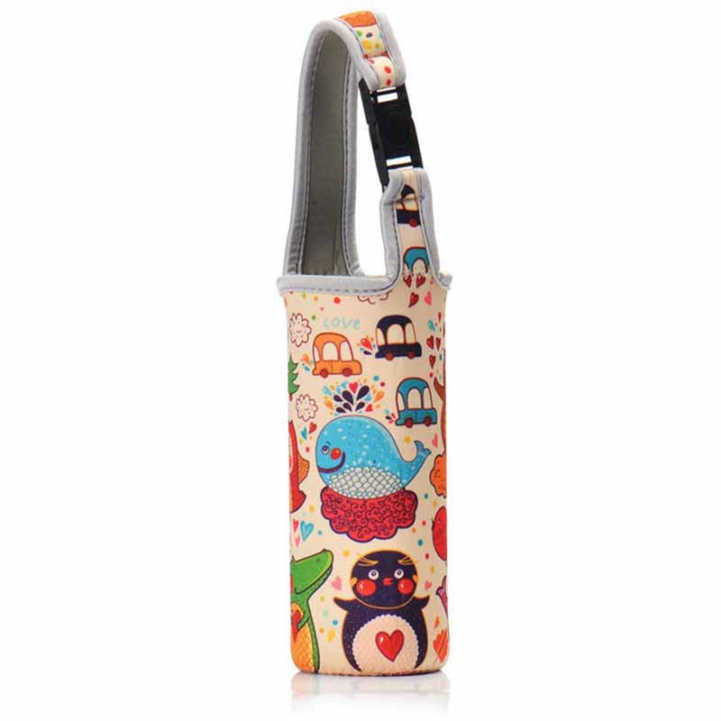
The essential specifications include foam thickness, density, laminated surface, finished dimensions, target container, stretch recovery, seam construction, bottom design, edge finish, print coverage, packaging, and measurable tolerances. For many standard branded can-cooler projects, 3 mm neoprene provides a balanced combination of structure, flexibility, print presentation, sewing stability, light insulation, packing volume, and commercial cost.
A product should be developed around the intended container and sales channel rather than copied from a generic listing. Beverage cans with the same stated volume can differ in height, diameter, shoulder shape, and taper. A sleeve that performs well on a traditional can may rotate loosely around a slim can or stop too low on a tall container.
The specification also affects freight and presentation. A thick fitted sleeve can feel substantial but occupy more carton space, while a folding model ships efficiently but may need reshaping before retail display. Individual bags, branded cards, barcode labels, cartons, and assortment packs should be included in the development process rather than added after production begins.
| Product Variable | Common Reference | Practical Effect | Main Risk |
|---|---|---|---|
| Thickness | 2 mm | Lightweight, flexible, economical packing | May feel less structured |
| Thickness | 3 mm | Balanced structure, flexibility, sewing, and cost | Still requires density and fit approval |
| Thickness | 4–5 mm | More bulk and structure | Higher seam bulk, cost, and carton volume |
| Standard US can | About 355 mL, roughly 66 mm diameter and 122 mm height | Common promotional format | Does not fit slim cans correctly |
| Slim can | About 355 mL, roughly 58 mm diameter and 146 mm height | Popular for seltzers and energy drinks | Standard sleeve can rotate or wrinkle |
| Tall can | About 473 mL, roughly 66 mm diameter and 157 mm height | Requires greater sleeve height | Short sleeve leaves excessive exposure |
| Sample timing | Often about 5–7 working days after confirmation | Allows material, fit, print, and sewing review | Shipping and revisions add more time |
| Bulk production | Often about 15–30 days after approval | Covers printing, cutting, sewing, QC, and packing | Complex artwork and packaging extend timing |
| Practical project MOQ | Commonly around 500 pieces for custom sublimated koozies | Supports efficient setup and production control | Many low-quantity designs reduce efficiency |
What Neoprene Thickness Is Best?
Three-millimeter neoprene is a common starting point because it offers a useful balance between structure and flexibility. It generally feels more substantial than 2 mm material while remaining manageable for folding, printing, cutting, sewing, packing, and stretching around standard beverage containers.
Two-millimeter material can suit high-volume promotional campaigns where budget, weight, and carton efficiency matter. It may provide less cushioning and feel lighter in the hand, but it can still perform adequately for events, giveaways, and short-term campaigns when the construction and fit are correct.
Four-millimeter and 5 mm materials create more bulk and can feel denser, but thickness alone does not guarantee a better product. Increased thickness changes the pattern dimensions, seam bulk, insertion force, folding behavior, shipping volume, and cost. A poorly engineered thick sleeve may fit less comfortably than a properly developed 3 mm model.
Foam density should be reviewed together with thickness. A firm 3 mm material may provide better recovery than a very soft 4 mm sheet. Buyers should compare physical swatches, measure the complete laminated structure consistently, compress the material, inspect recovery, and approve the final fit on the actual container before selecting the specification.
Which Can Size Should Brands Choose?
The correct size is the one developed around the actual can or bottle used by the target customer. The phrase “standard can” is not precise enough for an international production order because container dimensions vary by region, beverage category, and brand, even when the stated volume appears identical.
The buyer should provide height, maximum diameter, circumference, bottom diameter, and taper. For bottles, the shoulder and neck transition also affect the sleeve pattern. Sending several empty containers to the sample team is especially useful for licensed merchandise, beverage partnerships, retail programs, and specialty craft packages.
One universal koozie rarely fits standard, slim, and tall cans equally well. A pattern wide enough for a standard can may rotate or wrinkle around a slim can. A slim-can sleeve stretched over a wider container can overload the seam, lighten the printed colors, and prevent the bottom from opening properly.
When a product line includes several beverage formats, separate sizes normally provide a better user experience. Packaging, product codes, colors, or printed labels can help users distinguish them. The container model and measurements should remain part of the written specification so repeat orders do not rely on informal descriptions.
Is a Bottom Panel Necessary?
A bottom panel is not always required, but it changes fit, stability, insulation coverage, packing behavior, artwork visibility, and perceived product value. Folding koozies commonly include a flexible bottom section that opens when a can is inserted and collapses when the product is stored or shipped.
An open-bottom construction can simplify sewing and allow easier insertion, but it may slide upward more readily and offers less coverage beneath the container. A separately sewn circular base creates a fitted cylindrical appearance, although it requires additional material, cutting, stitching, and carton space.
Artwork near the bottom needs careful planning. A folding panel may become hidden or distorted during use, while a separately printed circular base creates another registration point. Important logos or text should not be placed in areas that are normally compressed, covered, or viewed only when the product is empty.
The choice should be based on user experience and commercial positioning. Buyers should test whether the base opens naturally, supports the container, remains stable on a table, and survives repeated insertion. More construction is valuable only when it improves performance or presentation rather than adding unnecessary cost.
Which Edge Finish Works Best?
Overlock stitching is widely used because it joins the neoprene panels and finishes the cut edge efficiently. It creates a visible thread border that works well for sports, promotional, casual, and event-oriented designs. Stitch density, thread tension, corners, loose ends, and edge compression need consistent control.
Binding covers the raw edge with a fabric tape and can create a cleaner, more refined appearance. It also adds a coordinated color opportunity and can protect the foam edge. The trade-off is increased labor, material, seam thickness, and the possibility of rippling or bulky overlaps around curves.
Some products use cleaner stitched or concealed edge constructions. These methods can support a minimal appearance but often require tighter control of cutting, lamination, adhesive, and sewing. The upper opening receives repeated pulling force, so visual simplicity should not compromise seam security or long-term edge stability.
The approval sample should be stretched repeatedly and then inspected around the opening, side seam, bottom connection, binding overlap, and exposed foam. Products should also be reviewed after several days in their intended packaging because compression can reveal weak lamination, distorted binding, or unsecured stitching.
How Should Fit Be Tested?
Fit testing should use the actual cold beverage container or a verified dimensional equivalent. The evaluator should insert and remove the container repeatedly, checking whether the sleeve opens naturally, remains secure, and can be handled without excessive effort. Artwork appearance should be reviewed before and after stretching.
A loose sleeve can rotate, wrinkle, sag, or fall away from the container, making even accurate printing look poorly positioned. A sleeve that is too tight can overload the side seam, prevent the base from opening, distort logos, and make dark or saturated colors appear lighter as the fabric stretches.